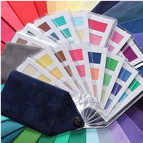
The four Seasonal Colour Palettes
Where did the colour theories begin?

Johannes Itten (1888-1967) was a Swiss painter, designer and theorist.
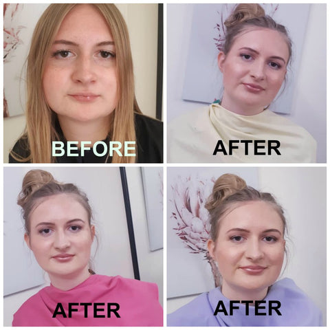
He believed colour could invoke feelings, and I agree. What do you feel when you walk into a strong bold monochromatic office? How do you feel when you visit a warm old country farm enriched with the golden hues of the Autumn Palette?
What colours do you envisage would enhance a seaside apartment, and how do you feel when you are in that space? Do you feel light, airy, fresh and happy in the shades of the Muted Summer Palette.
Then there are the bright and light colours of Spring and how do we feel at that time of the year, when we experience new growth and blossoms of the bright spring palette?
Itten theorized seven types of colour contrast, contrast by hue, value, temperature, compliments, simultaneous contrast, contrast by saturation and contrast by extension. He explained by using a colour sphere with the primary colours of red, yellow and blue.
He was the first to associate colour palettes with four types of people and labelled these with the four seasons.
What are the four seasons?

After many years the four seasons were developed in the 1950’s.
These four seasons reflect the seasons of nature. Spring, Summer, Autumn and Winter.
It was a clever way of grouping the seasonal colours as they reflect characteristics of the seasons they represent. Colours of the Winter season like the black sky, the white ice and grey days, paint a picture of dominant cool clear colours.
The soft muted colours of Summer-clear blue sky, soft yellow sand, soft green grass and the calypso colours that accompany our beautiful summer season.
Autumn ushers in the mossy greens and the brilliant colours of autumn leaves with the burnished colours of the trees.
Finally the delightful and delicate and bright colours of Spring with the fresh green grass and spring collection of budding flowers.
In relation to people, a particular colour palette with loads of variety can be designated to each person.
How did the four seasons become 12 or 16 seasons?
After many years, certain colour consultants deemed that 4 seasons were not enough to identify the numerous “types” of people on the planet.
This only managed to dilute and distort a perfectly functional and accurate way of doing colours.
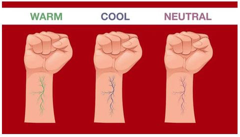
The original stated whether you are warm or cool ie, Autumn and Spring warm or Winter or Summer cool.
Then once that is determined a further breakdown accessed if you were the deeper or lighter of that breakdown.
So simple and so straightforward was this system. The problem was colour consultants failed to “see”the colours against the clients skin, thereby giving a false reading.
Therefore needing more sub categories.
And so we now have a further diluting of each of the four seasons, calling Spring warm, light and bright. Summer cool, light and soft. Winter bright deep and cool and Autumn warm, deep and soft which is just a further explanation of what these four main categories are. It’s just a repetition of what they are.
Further confusion with the seasonal colours.
Sadly now we have thousands of interpretations of what each of these colour breakups look like.
If you search it out each colour analyst will have different colours in each palette, and in fact most have a combination of all the seasonal colour palettes included in each category, with the colours from each of the spring, summer, autumn and winter palettes.
This leads to ultimate confusion for the client and a colour palette they adhere to with a real miss mash of colours and a totally uncoordinated wardrobe.
I see these clients after a while and they are not adhering to their palette at all because the palette may only have some of their colours and many wrong colours.
My final analysis on colour.
Stick to the four seasonal colour palettes.
Find accurate colour palettes that identify colours this way.
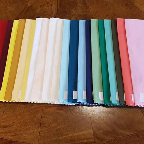
Winter colours are Cool, blue based, strong, primary and bold. They include black, white, all greys, Deep deep chocolate brown, extremely pale icy colours for contrast and the rich primary colours.
Summer colours are also cool, soft, muted and contain the deep colours of milk chocolate brown, beiges, taupes, soft grey, soft denims, burgundys, mint greens, soft emeralds, lemon yellows, muted pinks and purples, wedgewood blues, light blues and soft muted navys
Autumn colours are rich and deep and warm. Pumpkins and ochres and rich warm purples and golden yellows and warm golden browns and creams and teal and muted blues and rich warm burgundys as well as orange reds and all oranges.
Spring colours are similar to Summer colours and are often mistaken because they are the less intense, versions of colours, but they are much brighter due to the warm component and yellow base. You have lime greens and soft warm corals and peaches and warm browns and warm caramel browns and yellow beiges. Bright blues and bright greens and bright yellows are the happy colours of Spring.
This is just a small sampling of the colours that fit into the four palettes. All I know as an experienced colour analyst your colouring will suit one only of the four seasonal colour palettes. From there the rest is easy just start wearing ALL the many many many colours in your beautiful palette for a beautiful and colourful and co-ordinated functional wardrobe.
For more information contact Your Colours and Style.